*This post contains affiliate links. This means that I may receive a small commission if you buy from my link. I only recommend products that I use and love.
Are you happy with how your email list is growing? Do you have plans to grow your email list in 2025?
If you’re struggling to grow your email list, I can totally relate. I mean we all started at ZERO, but there are a few simple tweaks you can make to your website to start collecting MORE email subscribers.
Today, I want to talk about how you can start using pop-ups on your site to convert all those visitors into subscribers.
I use Kit (formally ConvetKit) as my ESP (email service provider) and I love it. They make it super easy to segment your list and create pop-ups, stand-alone forms, as well as full landing pages for your freebies.
Did you know Kit now has a FREE plan for up to 1000 subscribers? It’s true, but you can only get it with my link. Check out their free plan and start growing your email list with their free landing pages and forms.
Today, I want to talk specifically about how you can grow your email list with pop-ups and how these 3 “polite” pop-ups can make a huge difference…
In my first few years of blogging, I was hesitant to put any kind of pop-up on my site because I thought it was pushy and would turn people off.
I mean, I’m sure you’ve visited a site recently and been super annoyed at all the pop-ups going off. Maybe you were so annoyed that you even left and never went back. YIKES!
But I’m here to tell you that there is a way to do pop-ups that can be less annoying to your readers. In fact, there are three in particular that I’ve gotten really great results with.
So, let’s look at these 3 ‘polite’ pop-ups you’ll want to add to your site to rapidly grow your email list…
1 // The Exit Intent Pop-Up
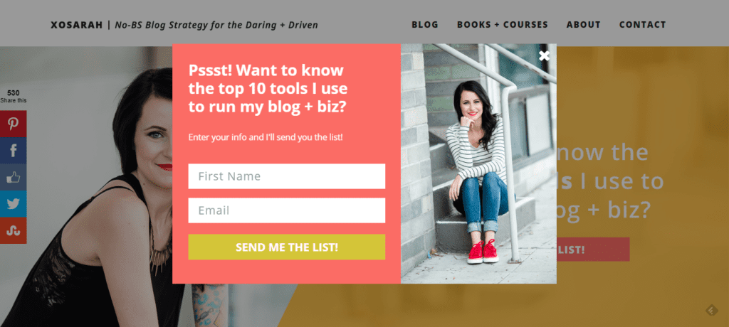
This has been called the polite pop-up form. This little pop-up is available with Kit and it’s only shown when a visitor is about to leave your site. I’ve been able to grow my email list big time once I installed this on my site. I even get conversion rates as high as 10% with my exit intent pop-up.
Why does this work so well? Well, a reader is less likely to be annoyed because they aren’t constantly being interrupted while reading or browsing your site. But you can’t just say “Join My Newsletter” and call it a day. You need to create an irresistible freebie that will provide a ton of value to your visitor in order to get that email address.
2 // The Slide In Pop-Up
I’m not sure if this can be called a pop-up because it doesn’t pop up but slides in from a corner of the screen. The great thing about this type of pop-up is that it doesn’t block someone’s view of your blog post while they’re reading.
You can also set this up in Kit and have it slide in after a certain amount of time has passed. I like that you can delay the slide-in until your reader has had enough time to look through your site and decide if they like your content and want even more.
3 // Full Page Pop-Up
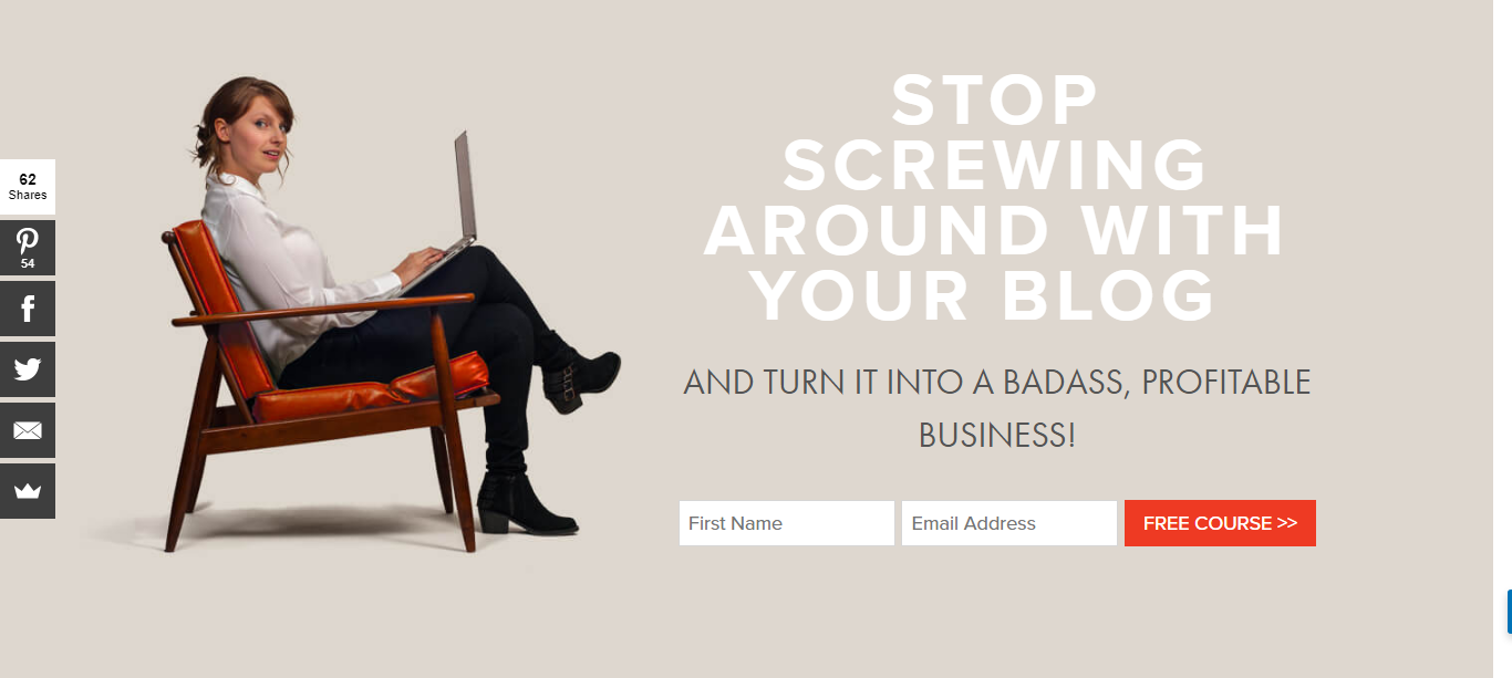
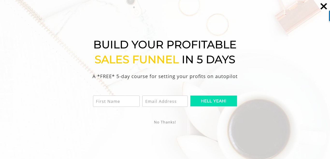
This isn’t really a pop-up per se. It’s a full-page form that is shown when someone first lands on any one of your pages. What I like about it is that you can catch them before they start reading anything, plus there’s also a ‘no thanks’ button they can select if they’re not interested right now. I created mine with SUMO. You have to pay for SUMO but it works so I really can’t complain.
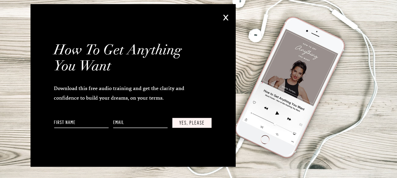
Here are some examples:
Right now I’m using the full-page pop-up along with the exit intent pop-up.
Here’s why it works: They see the full-page pop-up asking them to sign up for my 10-day Pinterest course, if they don’t sign up then they can browse my site and have a look around without any other ‘asks’ for their email address.
It’s like planting a seed in their mind, so they know it exists as they’re reading my free content.
Or maybe they forgot all about it? That’s why I give them a gentle reminder as they’re about to leave my site with the exit intent pop-up. They’ll have one last opportunity to sign up for the course before they leave.
I’ve seen such great results with these pop-ups. I’m just kicking myself for not implementing these things sooner.
What about you, will you be trying out any of these pop-ups on your site to grow your email list? Don’t forget to check out Kit to get access to their pop-ups, landing pages, and forms – all for free!

Hey Kyla!
Thank you for this post, it’s always good to read about how other people use different tools to grow their list. And it’s also nice to see actual conversion numbers. So thank you for sharing that.
I personally don’t use an exit intent popup as of now. I’ve been thinking about it, and with the numbers you share I might have to implement it.
I also use a fullscreen popup on my page (welcome mat) for people who are on desktop. I noticed that I didn’t have a very good conversion on that for mobile devices though, so I changed to have a ribbon for mobile. It feels less intrusive and it seems to be doing well. I’m slightly lower than the welcome mat on the ribbon, but I’m seeing over 10% conversion on the ribbon.
Thanks again for the post!
You’re welcome Anders! It really is about testing things.
You have to find what works best for your audience. So we always need to be testing and tweaking things.
Is the ribbon you mention a bar at the top of your site?
I agree. No audiences are alike I think. 🙂
Yes, the ribbon is similar to your notice about cookies. I think Sumo has something like that too? I get it through ThriveThemes that I use.
Take care, Kyla!
Anders recently posted…How To Save Money By Screwing The Joneses
Hi Kyla,
Thanks for sharing this post. It’s been very helpful.
It’s my first to hear those kinds of pop-ups. I only use pop up at the beginning of the loading of the homepage. I’ll definitely apply them.